ProCare Therapy Form Rework
A multivariant test to improve accessibility, usability, & conversion performance
+17.4% in
engagement
-4.5% in
abandonment
+26.76% in
conversions
Role: UX + UI Designer
Industry: Education Staffing
Tools: Figma, Hotjar, VWO, GA4
The Challenge
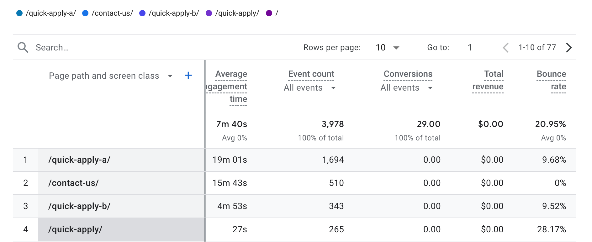
The original Quick Apply form showed signs of friction: high bounce rates, user drop-off, and accessibility issues. We suspected that a redesigned layout, guided by user behavior and accessibility best practices, could improve both engagement and conversions.
Original Form’s Color Contrast Results
Hotjar Heatmap Showing Order of Clicks
Accessibility Hypothesis
If we make the form more accessible (higher contrast, better layout, clearer error states), then conversion rates will be maintained or improved because the form will be easier to use for more people.
Usability Hypothesis
If the form follows a clearer user flow and makes errors easier to prevent and recover from, we’ll see lower bounce rates and higher completions—because the experience feels smoother and more intuitive.
The Experiment
We ran a multivariant test on three versions of the Quick Apply form:
Control (Original)
Heatmaps and recordings revealed friction points and high abandonment, as well as patterns of form field order. Most users began with the drop down field even though it was further down the form.
Variation 1: Pink
Redesigned for improved flow and based on observations from Mouseflow heatmaps and recordings.
Variation 2: Purple
Designed specifically with accessibility in mind: better contrast, keyboard-friendly fields, and clearer validation.
Includes all improvements to user flow as Variation 1.
The Results
Decreased Abandonment Rate by 4.5%
We saw a 4.5%+ decrease in abandonment, meaning more users were able to successfully complete the form.
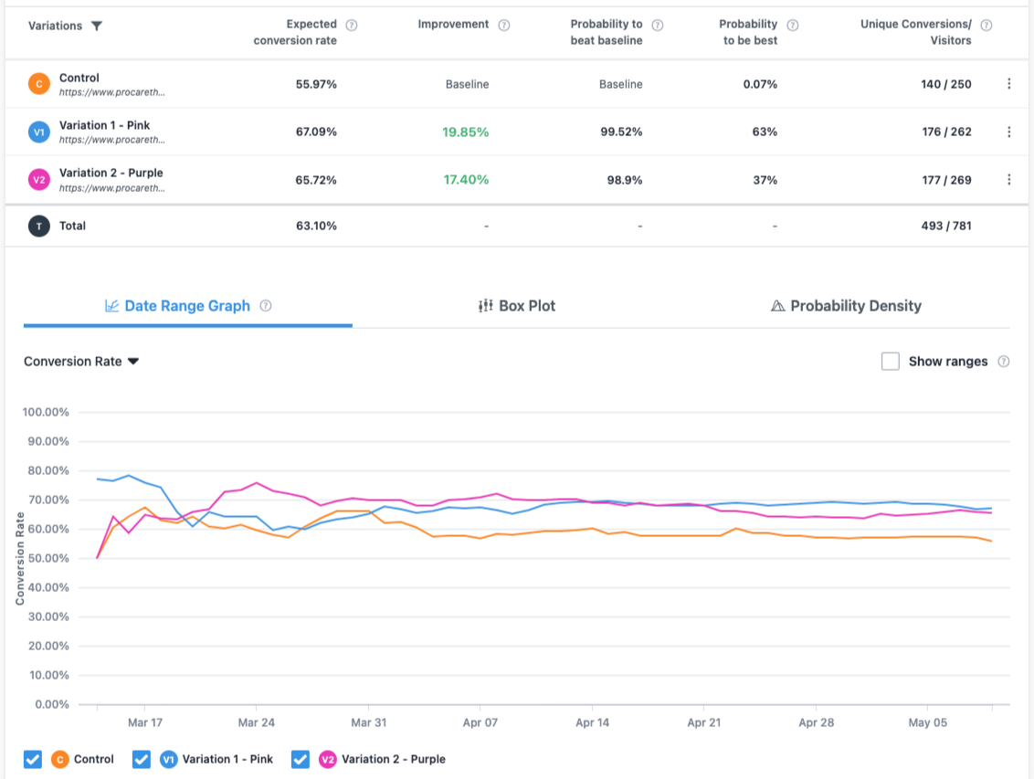
A +17.4% increase in form engagement
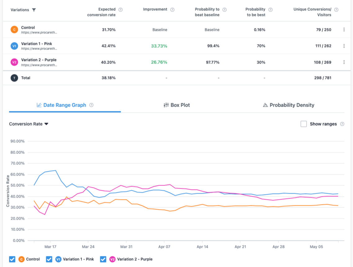
Both new layouts significantly outperformed the original in engagement and submission rates.
Increased Conversion Rate of +26.76%
The pink layout had the highest conversion rate, but the purple layout performed nearly as well—with the added benefit of meeting accessibility best practices.
Next Steps
Although the pink version slightly outperformed purple, the difference in performance is narrowing, and accessibility improvements make purple the best long-term choice. We recommended:
Implementing the purple version permanently
Monitoring metrics post-launch to ensure sustained performance
Applying accessibility and usability learnings to other forms and experiences across the site


