

Spindle
Brand & Site Built From Zero, Validated Through Testing
Personas | Branding | Website | Testing
The Challenge: Spindle was a brand-new education staffing company with no existing identity, site, or strategy. They needed a user-centered experience built from the ground up.
My Role: I led the end-to-end process: research, persona development, branding, and UX/UI design, ensuring every decision was rooted in real user needs.
Research
With no pre-existing product or users, research was critical. The focus was on deeply understanding the expectations, goals, and pain points of both core audiences.

Interviews
6 internal (therapists currently working for another brand) and 6 external interviews were conducted to uncover pain points.
Journey Mapping
Mapping theoretical user journeys helped identify where friction might arise and what guidance users would need to complete tasks smoothly from day one.
Personas
Following the interviews, I gathered and grouped my findings in an affinity map. This resulted in two distinct personas. One focused on therapists that specialized in full classroom teaching, while the other aligned with those in one-on-one therapy sessions of various ages and districts.


Please note: Some information has been hidden to protect the company’s privacy.
These personas guided every layer of the site and brand design, helping avoid assumptions and stay grounded in real user priorities.
Brand Design
Starting from scratch, I created a brand that was welcoming, professional, and easy to understand. The visual identity, color palette, voice, and messaging all stemmed directly from user expectations uncovered in interviews.
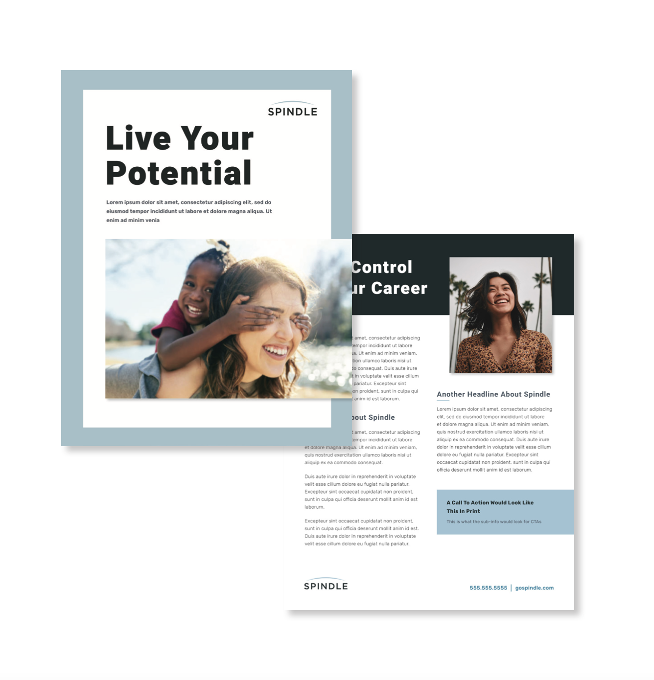
Vibrant, candid imagery of young therapists, often outdoors or with kids is used throughout to showcase the feeling of freedom that comes with travel therapy and the ease with which contracts are done through Spindle.
The brand was designed to feel uplifting and helpful, with a bit of a tech influence to incorporate the reliance on the Spindle app.


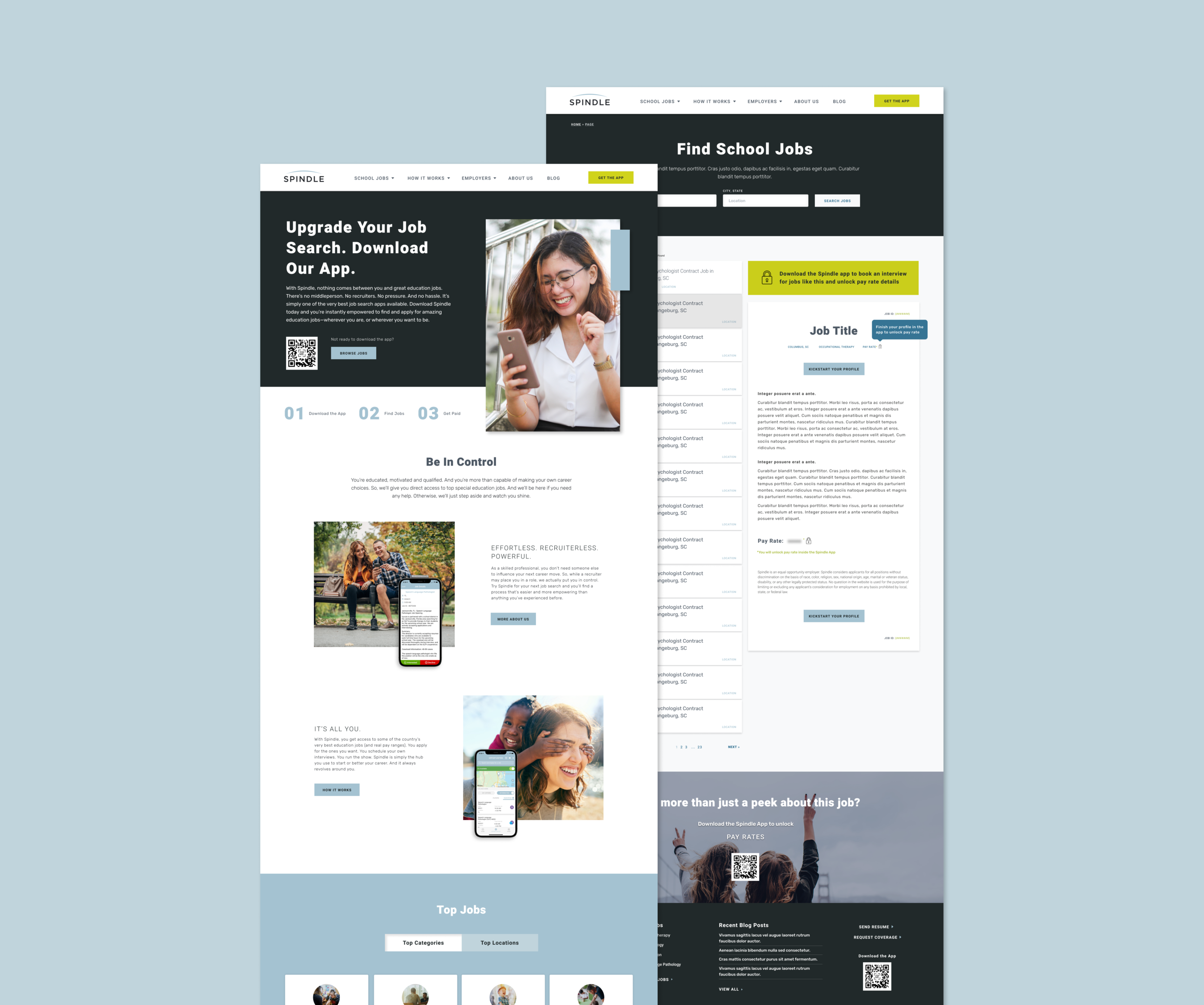
Website Design
Through research of Spindle’s competition, I discovered many travel therapy companies focused on multiple settings, rather than just schools. As a result, it was decided to emphasize Spindle’s speciality throughout the website and brand.

Information Architecture
The IA was designed from zero to reflect two clearly segmented paths, with each audience having a direct and intuitive flow.

Desktop Design
The prior audience research and interviews served as the backbone of the site design. It informed everything from imagery to micro interactions, to job post structure. Each page was purpose-built to reduce decision fatigue and support primary goals like searching jobs or submitting requests.

Mobile Responsive
From the beginning, the mobile experience was treated as a core use case, not an afterthought. The mobile application process was important for candidates who apply on the go; therefore; everything was designed to scale gracefully and intuitively on small screens.

Continued Testing
Because this was a new brand and site, early testing was essential to validate assumptions and refine key flows.
Following the site launch, using HotJar and Google Analytics, it was discovered that some page elements appeared clickable to users, particularly the ‘Browse Jobs’ link. As a result, an AB test was created to see how styling and placement could help ease this frustration.

Confused Clicks
Heatmaps in HotJar on the home page exposed that more users were clicking the ‘Find Jobs’ icon below the browse jobs link than the actual job link on both desktop and mobile.

AB Test
As a result of what was seen on the heatmaps, a variant of the original page was created. It included a styled button, rather than a link with the goal of making it clear to users how they can browse jobs. The steps were changed from icons that appear clickable, to numbers.
Goal: Increase click-throughs to the ‘Browse Jobs’ page through styling and placement.

Results
Success! The variant design had a better click-through rate of about 3.15%, while also reducing clicks on non-clickable components.