
Entegee
Repositioning a legacy engineering & tech staffing firm for a more modern, competitive market.
Branding | Collateral | UX/UI
Go to Site

Goal: Entegee had a long history of placing skilled engineering and IT professionals. But the brand had become visually outdated, inconsistent across platforms, and disconnected from younger talent. Entegee struggled to appeal to today’s job seekers and companies. The visual identity was dated, the messaging lacked clarity, and the website offered little differentiation in the market.
My Role: As one of two designers on the team for this project, we collaborated on different visual approaches following research and stakeholder goal setting. We produced a full brand and digital redesign to help Entegee reassert its position in a modern recruiting landscape, without losing the trust it had built over decades.
Discovery & Insights

Client Meeting
In order to get a better sense of Entegee’s needs, as well as the needs of their clients and candidates, a workshop was held in Boston where a group of Entegee leaders and employees had to fill out value proposition forms, persona ranking sheets, and select between six moodboards. It surfaced a desire to remain rooted in technical credibility while appearing more forward-thinking.
Moodboards


Surveys & Market Research
Stakeholder surveys and analytics showed user drop-off due to unclear messaging and a lack of modern visual appeal. Market Research revealed that competitors were increasingly investing in storytelling and sleek digital design.
Competitor scan revealed that many brands looked interchangeable. We saw an opportunity to break from the industry’s visual sameness.
Iterations
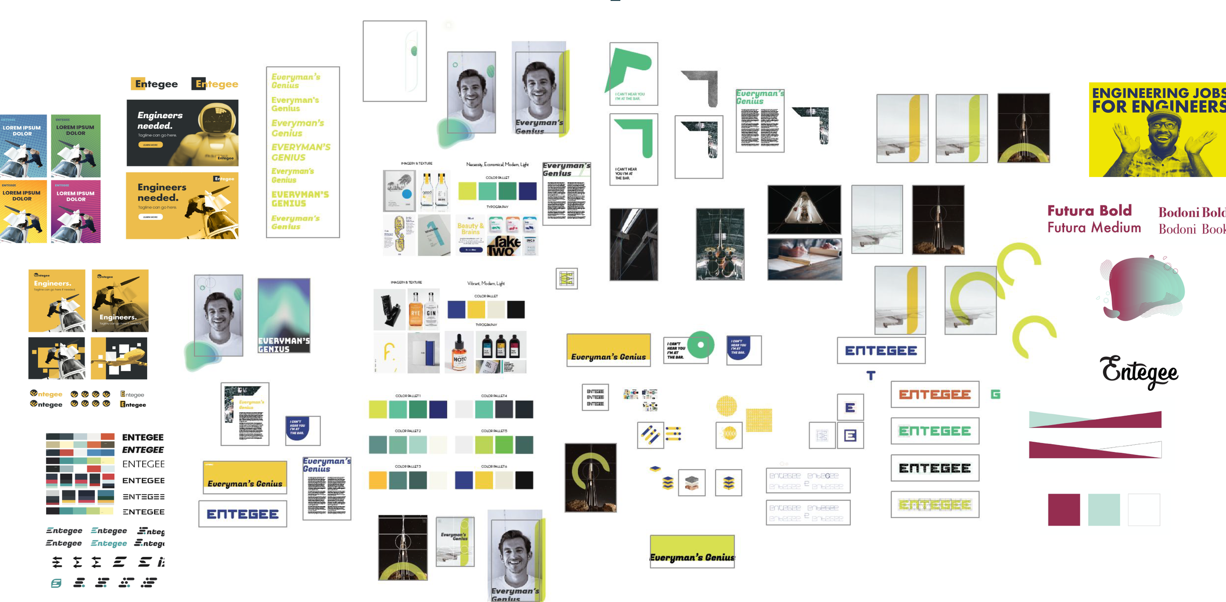
The next step after research was iteration. We explored how to visually communicate Entegee’s promise of smart talent and real-world impact. Design elements, typefaces, layouts, logos, textures, images were all created before grouping the best working elements into three concepts.
Initial Concepts

Concept 1
Based on the technical feats of engineering that we often take for granted. There’s a focus on the details and structure that is often overlooked in the everyday.

Concept 2
Combines the science with creativity. There’s acknowledgement of Entegee’s roots while also reaching for the future.

Concept 3
A bit of a wildcard. Focuses on the human side of what Entegee does. Showcases the personality of potential candidates.
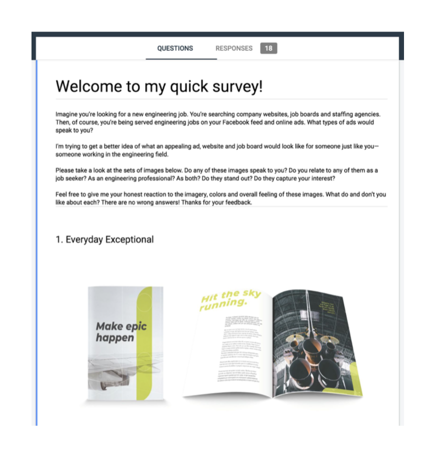
Concept Survey
A survey of the top 3 design concepts was sent to Engineers for feedback. Responses showed patterns of what they found relatable and what they disliked. Based on survey results the 3 concepts were narrowed down to the final 2 (Concept 1 & Concept 2 above) which were then presented to Entegee’s leadership.
Final Branding
The new Entegee identity is smart, bold, and unmistakably modern—built on the theme of “Everyday Genius.”
Entegee’s final brand is a combination of Concept 1 with elements of Concept 2.
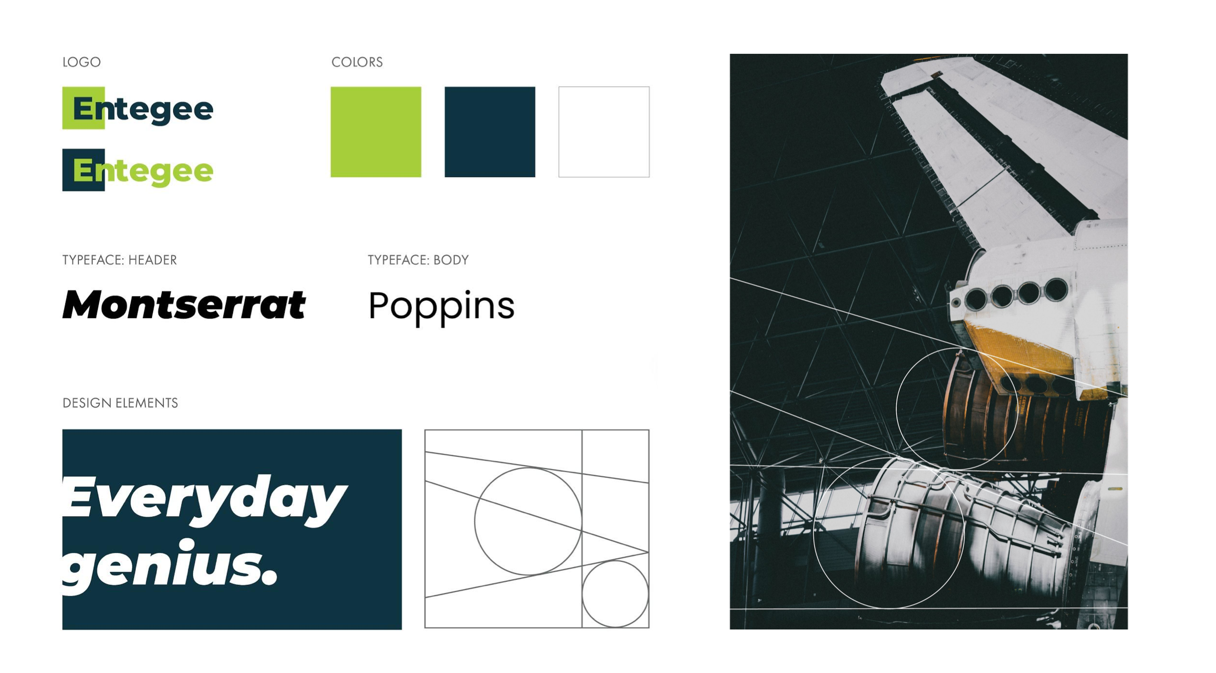
The logo illustrates how Entegee breaks out of the box. This concept is also demonstrated in the way large headers often break the margin and extend off the page. Grand, realistic photography is used throughout along with lines showing the technicality of the subject.


Website Design
IA Redesign clarified core offerings for both talent and clients.
The previous site was static and generic, failing to convey Entegee’s value or engage top candidates.
Go to Site
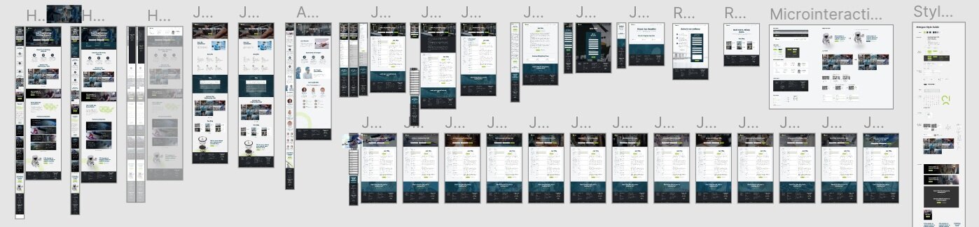

Desktop Design
The website design was created with the user in mind. We conducted internal research to study the Entegee audience and reduce points of friction. Every micro-interaction serves as a way to communicate to the user what an element is capable of.

Mobile Optimization
Recognizing that job seekers often search on the go, the new site was fully responsive and streamlined for mobile usability, especially job applications and contact forms.
Results
1
Internal teams reported increased confidence and alignment around the new identity
2
Recruiters said candidates found the updated brand more relevant and trustworthy
3
Improved UX and hierarchy reduced friction in common job-seeker flows
