RPh on the Go
Modernizing a trusted brand in pharmacy staffing.
Branding | Website | Microinteractions
Go to Site

The Challenge: RPh on the Go has been a recognized leader in pharmacy staffing for over 40 years. While the company’s reputation remained strong, its visual identity and user experience were outdated and inconsistent across digital touchpoints. Job seekers and clients alike found the site hard to navigate, visually dated, and lacking the clarity needed for fast hiring decisions.
My Role: Headed up the design strategy, brand design, and UX approach for this project. My goal was to lead a redesign that honored the brand’s legacy while positioning it for modern expectations.
Research
To ensure alignment with long-time users and internal stakeholders, I began with stakeholder interviews and a deep audit of the existing brand.

Stakeholder Meeting
Following the establishment of our project goal, interviews with leadership and marketing specialists were conducted to uncover key legacy values the redesign needed to preserve, such as dependability, personal service, and speed.

Competitive Analysis
A competitive analysis was conducted to get a sense of what others in the industry were doing. Research revealed how far behind RPh’s visual system and UX had fallen compared to modern staffing platforms.
Brand Design
RPh On the Go’s brand identity was distilled down to 3 visual pillars: Human-Centric, Modern, Friendly. Multiple iterations were shown to stakeholders before the final brand was selected.
* Note: Stakeholders chose to keep the original logo

The selection of san serif fonts and vibrant colors provide a modern touch to the RPh brand. As a result of the competitive analysis, blues were chosen to keep in line with the industry but they are more vibrant and paired with the accent teal to make the brand stand out in pharmaceutical magazines often used to promote the brand.
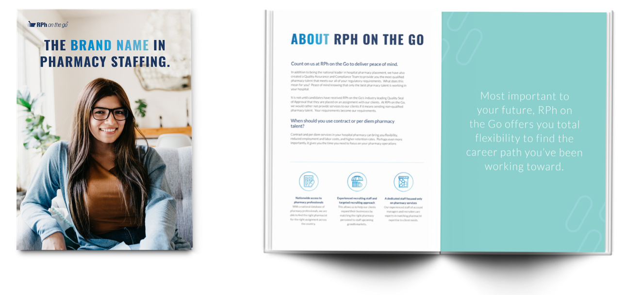

The brand’s imagery is that of a diverse workforce, often not showcased in other pharmacy brands. The photos are candid and personal, providing that friendly feel that aligns with one of the 3 pillars.
The pill pattern and pill elements tie in the main focus of RPh On the Go, allowing for more versatile imagery settings and don’t just include pharmacists in white coats, rather as real people.
The majority of competitors appeared dated and non-inclusive. As a result, it was decided to emphasize RPh’s evolution while still maintaining it’s authority in the industry.


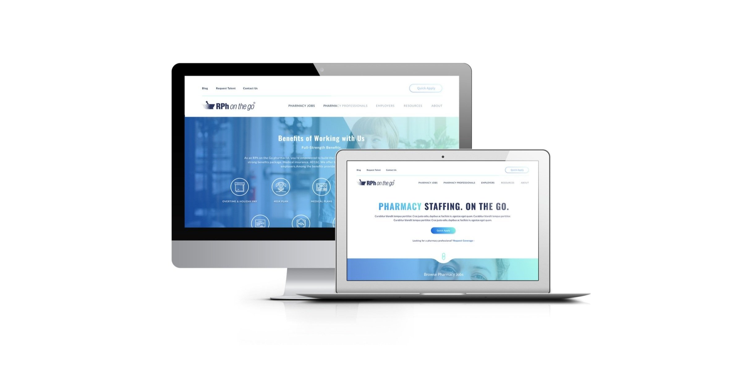
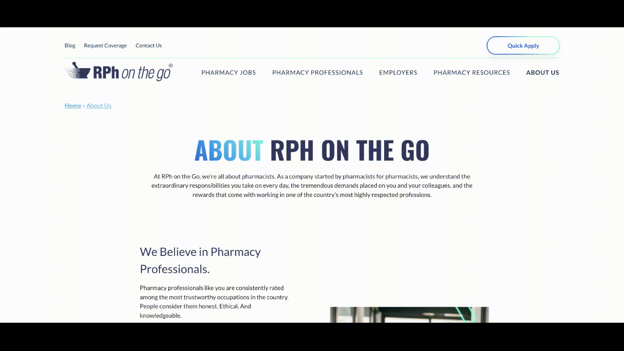
Website Design
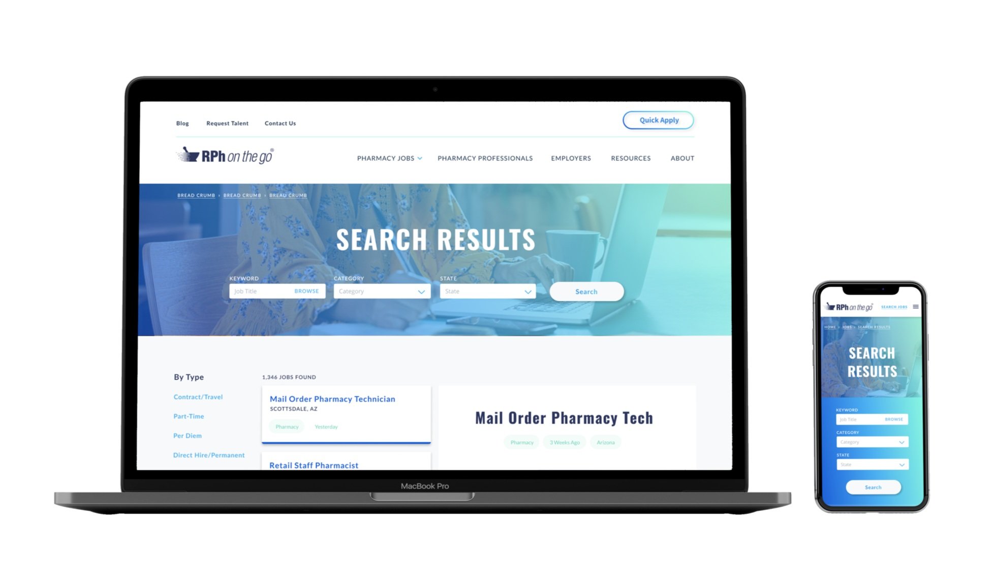
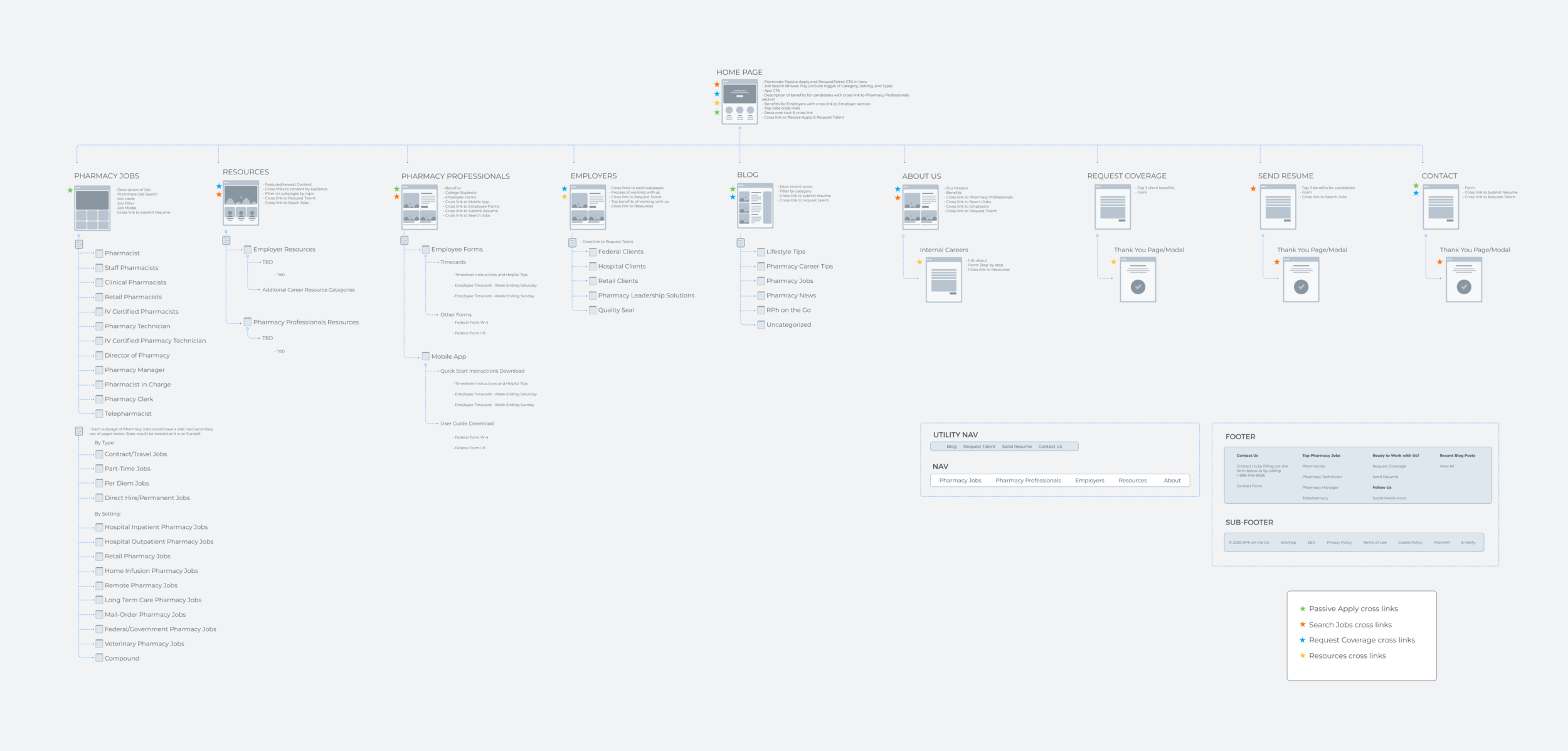
The new site focused on user clarity and speed, allowing pharmacists and clients to find what they need quickly. I reorganized to prioritize the most common tasks: searching jobs, submitting resumes, and requesting talent.
Go to Site

Before

After
Navigation was simplified for both mobile and desktop users. Information architecture was rebuilt to reduce friction and surface the brand’s credibility.

UX Solutions
From the beginning, it was important to work collaboratively with our SEO team to keep and even better RPh’s seo rankings. This required some thoughtful solutions when it came to the job search pages since some categories needed their own pages without a filter.
The solution: create a search within category pages.
Microinteractions
Each microinteraction on the site was created with the intention to amplify ease of use, as well as assist in the consumption of information.
The Results
1
Positive internal feedback from long-time RPh recruiters and pharmacists
2
Reduced user confusion around job application steps through optimized search results
3
A modern visual and interaction system that reestablished trust for a digital audience