BlazerWorks Design System Foundation
Establishing a scalable design system with structured token architecture, BEM naming conventions, and an OKLCH color framework to accelerate development, improve accessibility, and create lasting consistency across the BlazerWorks site.

One system. One source of truth. Every component, every color, every decision: defined once and inherited everywhere.
Build a system that scales, not just a style guide
BlazerWorks needed more than documented patterns. The goal was a living, token-based design system that design and engineering could both operate from — one that reduced drift, accelerated handoff, and made accessibility improvements fast to ship at scale.
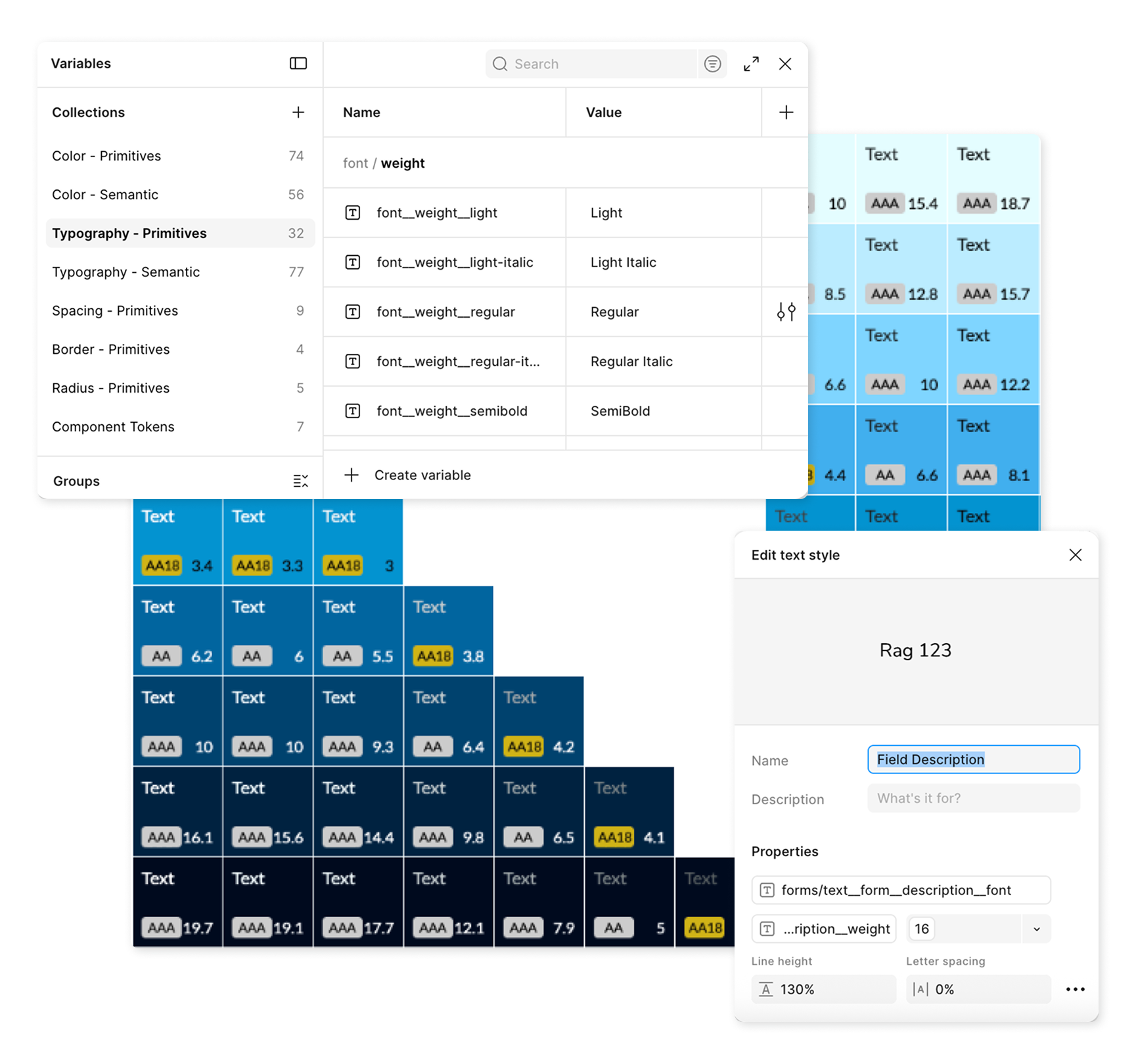
Variable documentation
Scalability
A token architecture that lets the system grow without breaking, changes cascade correctly rather than requiring manual updates across every component.
Dev Alignment
BEM naming conventions that map directly to code, so design decisions translate into implementation without interpretation or guesswork.
Accessibility at Speed
An OKLCH-based color system that makes contrast-compliant updates fast, consistent, and propagated globally rather than fixed one-by-one.
Structured from the ground up: tokens first, components second
The system was built in layers, starting with foundational decisions and working outward. Each layer informed the next, ensuring that components inherited values from a structured hierarchy rather than being defined in isolation.
Tokens before components. Naming before building. Structure that design and engineering could share from day one.
Three-layer token architecture
Layer 1
Primitives
Raw values: OKLCH color scales, spacing, type sizes. No semantic meaning yet.
Layer 2
Semantic Tokens
Meaning attached to values.
Layer 3
Component Variables
Tokens per component to allow function without overriding foundations.
Color primitives, color semantics, and component tokens
How it was built
01
Defined foundational primitives and naming system (BEM)
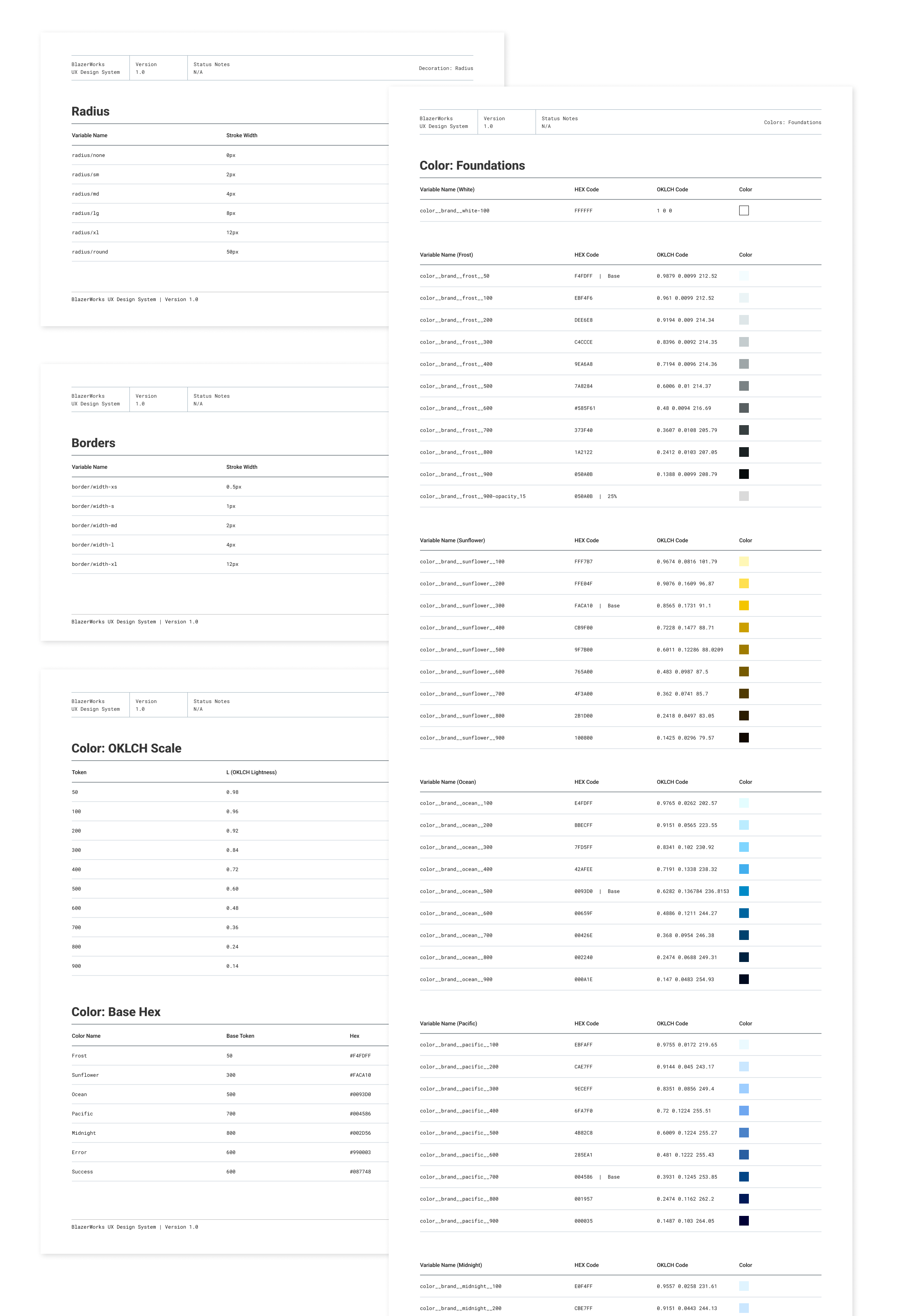
OKLCH color scales, type ramps, and spacing values acted as the base layer.
02
Mapped primitives to semantic roles
That way intent, not raw values, drive design decisions.
03
Created component-level variables
Allowing overrieds without touching primitive. tokens
Why OKLCH?
OKLCH (Lightness, Chroma, Hue) produces perceptually uniform color scales, meaning a change in lightness value looks consistent across hues. This makes accessible contrast ratios predictable and fast to implement, rather than requiring manual testing every time a color is adjusted.
Faster to build, easier to maintain, and accessible by default
The system delivered measurable improvements across four areas, from how quickly teams could ship to how confidently they could update color without breaking anything downstream.
A global color update now takes minutes, not days. Change one token and every component inherits it.
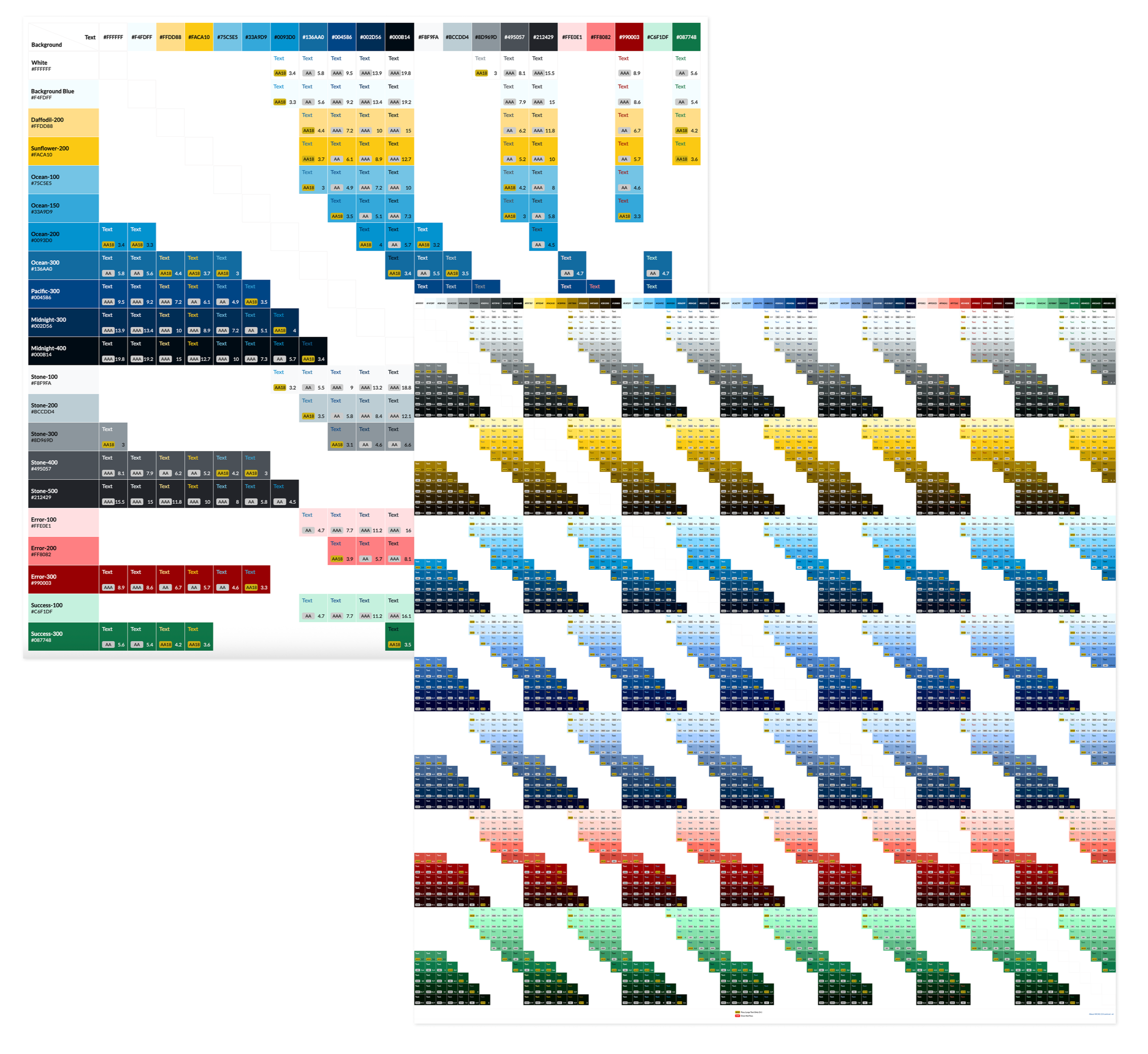
The accessible color combinations available prior to OKLCH system versus after.
Scalability
Structured token layers enable consistent decisions site-wide. Design drift is reduced because styles are defined once and reused.
Dev Handoff
BEM-aligned naming means design files and codebases speak the same language. That means faster, more accurate implementation.
Accessibility
OKLCH color system allows global contrast updates, eliminating manual fixes and minimizing the risk of inconsistencies.
Maintainability
Centralized component variables mean teams adjust tokens, not individual styles.
What this establishes and where it goes next
The BlazerWorks site serves as the foundation for a broader system rollout. The architecture is designed to scale beyond a single project.
A design system is never finished. This one is built to grow without breaking what came before it.
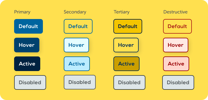
Button components using the OKLCH color system to guide shifts in lightness for various states.
Structure
Naming conventions are infrastructure
BEM alignment between design and development is not a style preference, rather the mechanism that makes handoff consistent.
Accessibility
Accessible systems are faster systems
OKLCH color logic allows updates that used to require cross-component audits now happen in one place.
Collaboration
Shared language reduces friction at every stage
When design tokens and code variables use the same names, conversations between disciplines get shorter.